This comprehensive guide dives into the powerful responsive design features in Flowmo, enabling you to create websites that adapt beautifully to any screen size. We’ll cover the basic principles, breakpoints, and advanced techniques to empower you with full control over your layouts.
Understanding the Basics #
Constraints #
Constraints act like magnets, dictating how elements stick to the screen as it resizes.
Let’s focus on horizontal constraints for now:
When resizing the screen it should look like this:
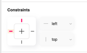
Top element – The distance between the left edge of
the element and the left side of the screen remains constant.
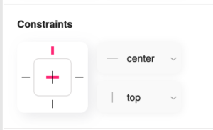
Middle element – The element remains centered on the screen.
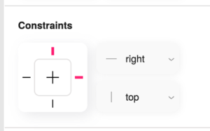
Bottom element – The distance between the right edge of
the element and the right side of the screen remains constant.
Pixels and Percentages in position and dimentions #
Let’s start with an example of two objects:
- The top one width is set to pixels – elements with pixel dimensions remain a fixed size regardless of screen size.
- The bottom one width is set to percentages – elements with percentage dimensions scale proportionally to the screen’s width or height.
An image with a width set to 50% will occupy half the screen’s width, regardless of the screen size. However, its height might remain fixed unless we use the next feature.
Aspect Ratio Lock #
This feature prevents image distortion when scaling with percentages. It ensures both the width and height scale proportionally, maintaining the image’s original look.
When you apply the aspect ratio lock to an image with a percentage width, it retains its proportions as it scales, preventing stretching or squashing:
Adaptive Design #
By selecting the page (main frame) and navigating to its properties you can enable Adaptive design – it allows your entire design to scale uniformly
based on the current page size. It’s perfect for scenarios where you want a consistent visual experience across all devices.
With adaptive design enabled, a design will proportionally shrink or grow to fit different screens, ensuring the layout remains visually consistent:
Automatic Layout #
Automatic layout is a game-changer for responsive design. It creates dynamic relationships between elements, allowing them to adjust their position and spacing as the screen size changes.
Automatic Layout Example #
Let’s say you have an image and some text. With automatic layout, you can ensure they always stay aligned and properly spaced, even when the screen shrinks, creating a cohesive look across all devices.
Controls how elements align within their container (e.g., top, center, bottom).
Determines the flow of elements—whether they stack vertically (top to bottom) or horizontally (left to right).
Sets the spacing between elements. You can control horizontal and vertical gaps independently.
Adds spacing between the elements and the edges of their container, add separately to each axis.
Breakpoints #
Breakpoints are pivotal for granular control over your design at different screen sizes. They allow you to create specific layouts tailored for various devices, such as desktops, tablets, and mobile phones.
- Right-click on your page (main frame) and select “Add Breakpoint”.
- Define the screen size at which this breakpoint should activate.
- Connect breakpoints to ensure a smooth transition between different layouts. This ensures elements maintain their relationships as you move between breakpoints.
You can create distinct layouts for desktop, tablet, and mobile, with each breakpoint triggering the appropriate layout based on the screen size. This ensures a visually appealing and user-friendly experience on every device.
If you already have two designs you would like to connect:
- Select any of the pages you want to connect.
- Go to properties.
- Click ” Pick to connect” and use the eye dropper to select the other breakpoint, either from the viewport or from the layers list.
Advanced Techniques #
Flowmo’s pro features unlock a new level of control over element behavior.
Since this guide is about responsive design, the major features it unlocks are
- Prevent elements from exceeding a specified width/height, ensuring they fit nicely on smaller screens.
- Ensure elements never shrink below a defined width/hieght, preserving readability and visual appeal on larger screens.
- Take control of text readability by setting minimum and maximum font sizes. This ensures text remains legible and visually appealing across all screen sizes.
Maximum Width Example #
Set a maximum width for an image so it scales proportionally but never exceeds a certain size, preventing it from breaking your layout on smaller screens.
Define a minimum font size for text to ensure it’s always readable on larger displays.
Conclusion #
By mastering these responsive design techniques in Flowmo, you’re empowered to create visually stunning and highly functional websites that seamlessly adapt to any screen size. Start experimenting with constraints, automatic layout, breakpoints, and advanced features to create a user experience that shines on every device.


