Breakpoints are pivotal for granular control over your design at different screen sizes. They allow you to create specific layouts tailored for various devices, such as desktops, tablets, and mobile phones.
Duplicate as breakpoint #
- Right-click on your page (main frame) and select “Add Breakpoint”.
- Define the screen size at which this breakpoint should activate.
- Connect breakpoints to ensure a smooth transition between different layouts. This ensures elements maintain their relationships as you move between breakpoints.
You can create distinct layouts for desktop, tablet, and mobile, with each breakpoint triggering the appropriate layout based on the screen size. This ensures a visually appealing and user-friendly experience on every device.
Connect already made frames #
If you already have two designs you would like to connect:
- Select any of the pages you want to connect.
- Go to properties.
- Click ” Pick to connect” and use the eye dropper to select the other breakpoint, either from the viewport or from the layers list.
Advanced breakpoints #
Flowmo’s pro features unlock a new level of control over element behavior.
Fine-tune Breakpoint Ranges (Pro Feature):
- Activate “Pro Options” from the top bar.
- Select the desired breakpoint main frame.
- In the right panel, define the minimum and maximum widths for the breakpoint to be active.
- Repeat this process on all breakpoints.
Example of advanced breakpoints #
Assuming you have two breakpoints
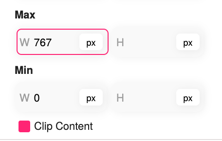
You would want to set the mobile breakpoint to min: 0, and max: 767
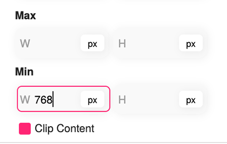
You would want to set the desktop breakpoint to min: 768, you can keep the max empty, or set a really high value


