Constraints #
Constraints act like magnets, dictating how elements stick to the screen as it resizes.
Let’s focus on horizontal constraints for now:
When resizing the screen it should look like this:
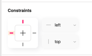
Top element – The distance between the left edge of
the element and the left side of the screen remains constant.
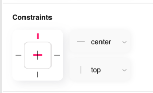
Middle element – The element remains centered on the screen.
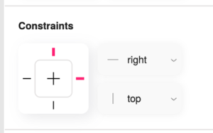
Bottom element – The distance between the right edge of
the element and the right side of the screen remains constant.
Pixels and Percentages in position and dimentions #
Let’s start with an example of two objects:
- The top one width is set to pixels – elements with pixel dimensions remain a fixed size regardless of screen size.
- The bottom one width is set to percentages – elements with percentage dimensions scale proportionally to the screen’s width or height.
An image with a width set to 50% will occupy half the screen’s width, regardless of the screen size. However, its height might remain fixed unless we use the next feature.
Aspect Ratio Lock #
This feature prevents image distortion when scaling with percentages. It ensures both the width and height scale proportionally, maintaining the image’s original look.
When you apply the aspect ratio lock to an image with a percentage width, it retains its proportions as it scales, preventing stretching or squashing:


